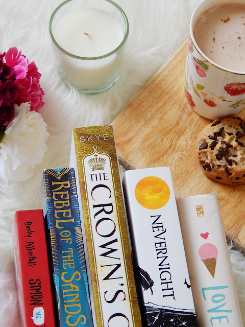
5 Books That Have Incredible Spines!
Today I’m going to be doing a different sort of post which
isn’t book reviews, recommendations or tags! I’m going to be chatting about
book spines!
It sounds a little silly, I know, but just bear with me.
Book spines are really important! They are often the only thing you can see of
a book in a bookshelf whether it be in a library or in a bookshop and they are
what really draw a reader into reading the book, whether it be the font, colour
or image on them!
I know that the inside of the book is just as important
because that is what really makes the book but I also believe that we need to
show some love to the wonderful cover designers who really make the book come
alive and make it aesthetically attractive and pleasing.
But basically, I’m going to be chatting about some of the awesome
book spines on my shelf (and a little about the books themselves!).
1 | N E V E R N I G H
T
Nevernight by Jay Kristoff IS SO GORGEOUS CAN WE JUST TAKE A
MOMENT PLEASE??? I haven’t had a chance to read the book yet but I am most definitely
going to be doing that soon because it sounds amazing and the outside is so
aesthetically pleasing. The font is gorgeous and I love the white background
with the black and then the pops of colour.
The cover for Nevernight was illustrated by Kerby Rosanes.
2 | T H E C R O W N ‘ S
G A M E
Onto the next book! The Crown’s Game by Evelyn Skye is
another one I have yet to read however, it is also just so goddamn gorgeous! Especially
the spine. I love the gold, the white, the dark lettering and how it really
matches to the cover. It is such a beautiful book and I’ve heard the story is
absolutely amazing.
Unfortunately, I wasn’t able to find who designed the cover
for The Crown’s Game however, if you do know, please shoot me an email and let
me know!
Simon VS The Homosapien Agenda by Becky Albertalli is a book
I have read and enjoyed! However, the spine is so pretty! I love colours and the
font (how it looks like handwriting) and the speech bubble and whoever designed
this was absolute boss!
I am not sure who designed the cover also however, the book
does say the typography was done by Torborg Davern.
4 | L O V E A N D G E L A T O
Love And Gelato, writen by Jenna Evans Welch is a book that I have seen on a lot of people's Instagram. It also seems really awesome and I AM SUCH A SUCKER FOR ICE CREAM I'd read it even if it wasn't awesome! (But it sounds awesome so..) I also love a good contemporary during the warmer months (once again, especially one that has ice cream on the front and the spine).
The jacket design and illustration for this beautiful book was done by Carina Granda.
5 | R E B E L O F T H E S A N D S
The Rebel Of The Sands spine is so absolutely gorgeous especially because IT'S SHINY!! (Yes, I get distracted by shiny things.) It's beautifully designed and very repersentative of the book and the colours used are perfect!
It doesn't say who designed it unfortunately because they deserve a huge round of applause!
Anyway, that is it for my post! Hope you enjoyed it.
What are some of your favourite bookish spines?
Let me know below!


0 happy thoughts
Leave me a comment below! And feel free to leave your website URL so I can come visit!